Canon Evaluation
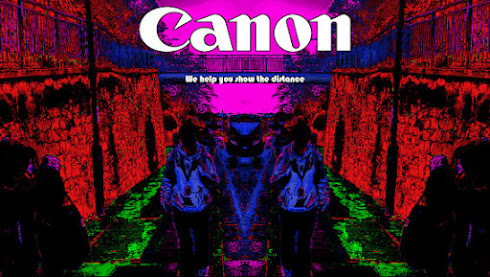
In conclusion this poster is great for the canons campaign as it effectively complicates that the night life Aesthetic without being too confusing to look at. The colours that are being used are picked with a certain reason as the sky is purple which represents bravery and wisdom which is why it’s on the the poster. Green is the colour of nature and that’s why it’s on the ground, the colour blue represents intuition and inner peace so I chose the subject to be that colour. And red is the the colour that’s the most eye catching so it’s the colour that covers most of the image making this advert great for catching peoples eyes.
The slogan of the advert is “we help you show the distance”. This wording is a play on “go the distance” as its a line that is very common as it can be used in lots of different ways as it’s been used in different variations as it’s been in adverts supporting marathons and things of that nature. It’s also been used in the past for mental journeys to help people become better. The slogan “we help you show the distance” refers to not only the physical distance but also the company’s product which is cameras. The positioning of the slogan is just under the canon logo using a bubbly font which is used to bring a fun and playful aesthetic to the advert.
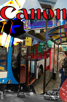
The location of the image is also connected to the idea of journeys as its a bus stop and also the composition of the shot it being a medium wide shot which helps show the surroundings but also the background very well.
Like I've said in other posts this poster fits the brand as it effectively shows what the product is and who it is aiming to as it has a night life aesthetic which targets younger people who are extroverted and that fits with the campaign which is for travelling.


Comments
Post a Comment