Canon Pre-Production/Production/Post Production
Pre Production Ideas and Experimentation
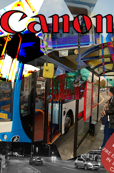
The image above are the first attempt at creating a canon advert for the journey campaign. The reason this advert looks very different to the final products is because I just wanted to experiment with Photoshop and its features before creating my poster. In my experimentation I used multiple layers and filter pre-sets for the first time. I also got used to using the lasso tool in Photoshop as I used it to cut out portions of the image and then applied a image behind that layer to clash both images together to get a cool effect.
Production
The images taken above were taken on an Iphone 11 which has a dual-lens 12 MP rear camera array as its camera and I took these images in the 1080p resolution and these images were considered for the final product but after trying to edit them they turned out not as good as they ended up looking odd and not like any i wanted for my advert but this is okay as they weren't the ones I had planned to shoot but they were experimentation so I decided to use the image below which is the image I planned for. The reason I decided to use this image over the other ones is simple, it allowed my use subject to be seen clearly and also the bus and it was just clear enough to understand what they are after all of the effects I add to the images in Adobe Photoshop.
Post Production
The image above is the image I had taken for this project and on it's own, it's pretty plain so I began by changing the image by changing the image with Adobe Photoshop by cropping the image in half and adding the same image underneath and flipped the new image horizontally. I believe this adds a lot to the overall image as its simple to understand but also cool to look at.
I began changing the colour in the image to make the image more eye catching the way i did this is by adding a the colour range effect in the select tile at the top of Photoshop and doing this I thought the image looked strange but then I decided to add the final touch which is to make the main image black and let the highlights take centre stage. I also added the tittle canon and the tag line we help you show the distance which is a play on the words we help you go the distance which is used in motivational speeches and commercials that have to do travel like car commercials for example.
This image above is my least favourite of the final product as the colour choices seem off to me and don't blend well together like the other visions of the final product and doesn't match the night life aesthetic I wanted to emulate. But it was the beginning of experimenting with these colours as a way to show whats happening in the black picture. the way I did this is I selected the original layer that has the image and select image tab at the top of Adobe Photoshop then adjustments and Hue/saturation and in that setting I changed the lightness all the way down so the image is black underneath.
This image I believe is a little better then the one before it as the colours are more eye catching and more bright but this version strays even more far away then the one before in terms for the night life aesthetic as this edited version makes it look set at day time. This was clearly not fitting to the night life aesthetic so I began to change the colours from high key colours to low key lighting colours. Also to do this I simply changed the Hue/saturation to the colours I wanted.
This version above is where I believe I started to think I was getting somewhere with this idea as the night life aesthetic was every much present in this image despite the original picture being taken at day time. The only downsides to this edited version is that there isn't a lot of colours to help the viewer understand whats happening in the photo as the image is to dark and there is only 2 colours to differentiate the subject from the background of the image.
This final image is the image I think is the best out of all the edits I've done as it perfectly matches the night life aesthetic and also is just complicated enough to let the viewer understand whats going on in the image because of the variety of different colours and the colours also improve the aesthetic of the overall image.


Comments
Post a Comment